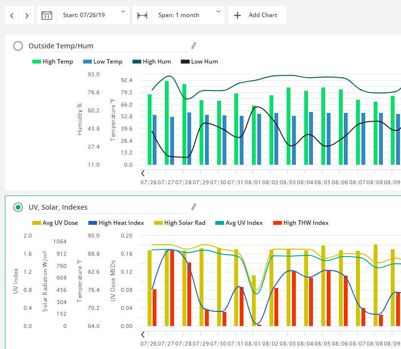
New Feature: Multiple Charts for Enhanced Data Comparison
There’s a new feature on WeatherLink.com that will make it even more fun to compare weather parameters, sensor locations, or even different sensor suites.
Now WeatherLink.com Pro users can set up three different strip charts, showing up to 12 different data points.
If you are a WeatherLink.com Pro user, when you click chart from the top bar, you’ll see a new button: + Add Chart. Clicking this creates a new strip chart, with a default name of “Chart 2.” Under your name on the right side of the page, you’ll see a list of parameters available on your stations. Choose which you’d like to see in your new chart. (Since you can select up to 12 parameters over three charts, you may have to change the number of parameters you are charting on “Chart 1".) Click Update. Being able to spread the data points over three charts lets you see them more clearly and compare them over the selected time span.
Now you can also give your chart a name (click the icon that looks like a pencil). We’ve also streamlined changing each data point’s color, and whether you want to see a bar or line graph of that data point. When you close your charts, they will be saved for next time.
For example, you can see exactly how your inside temperature and humidity reflect the outside temperature and humidity. Or how the wind station on the roof compares to the anemometer on your Vantage Vue in the garden. Or how the humidity from your indoor humidity sensor in the basement compares to the humidity upstairs. The variations are endless!

In the face of escalating environmental risks, AEM is the essential source for insights on weather, climate, lightning, floods, wildfires, water management, and more.
Learn more about AEM and all of our solutions here.


